The GUI for the Mark II was designed with some simple principles in mind.
1. The visual interface is always secondary to the voice interface. Our goal was to make all interactions Voice First, meaning that the user could accomplish their tasks with just voice interaction.
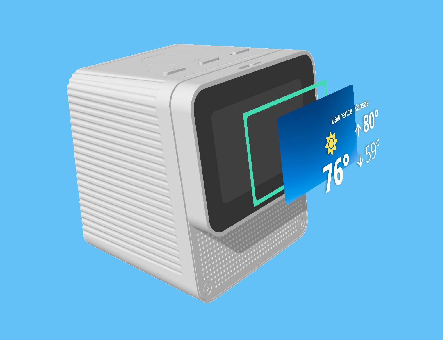
2. The visual interface was designed for useability at 6 feet. This meant less detail and larger text.
3. Touchscreen menus should be kept to a minimum, this reinforces using the primary mode of interaction, voice. However, many important controls were implemented as multimodal such as the ability to return to the home screen, change the volume, change the brightness of the screen, control media playback, and other system settings.
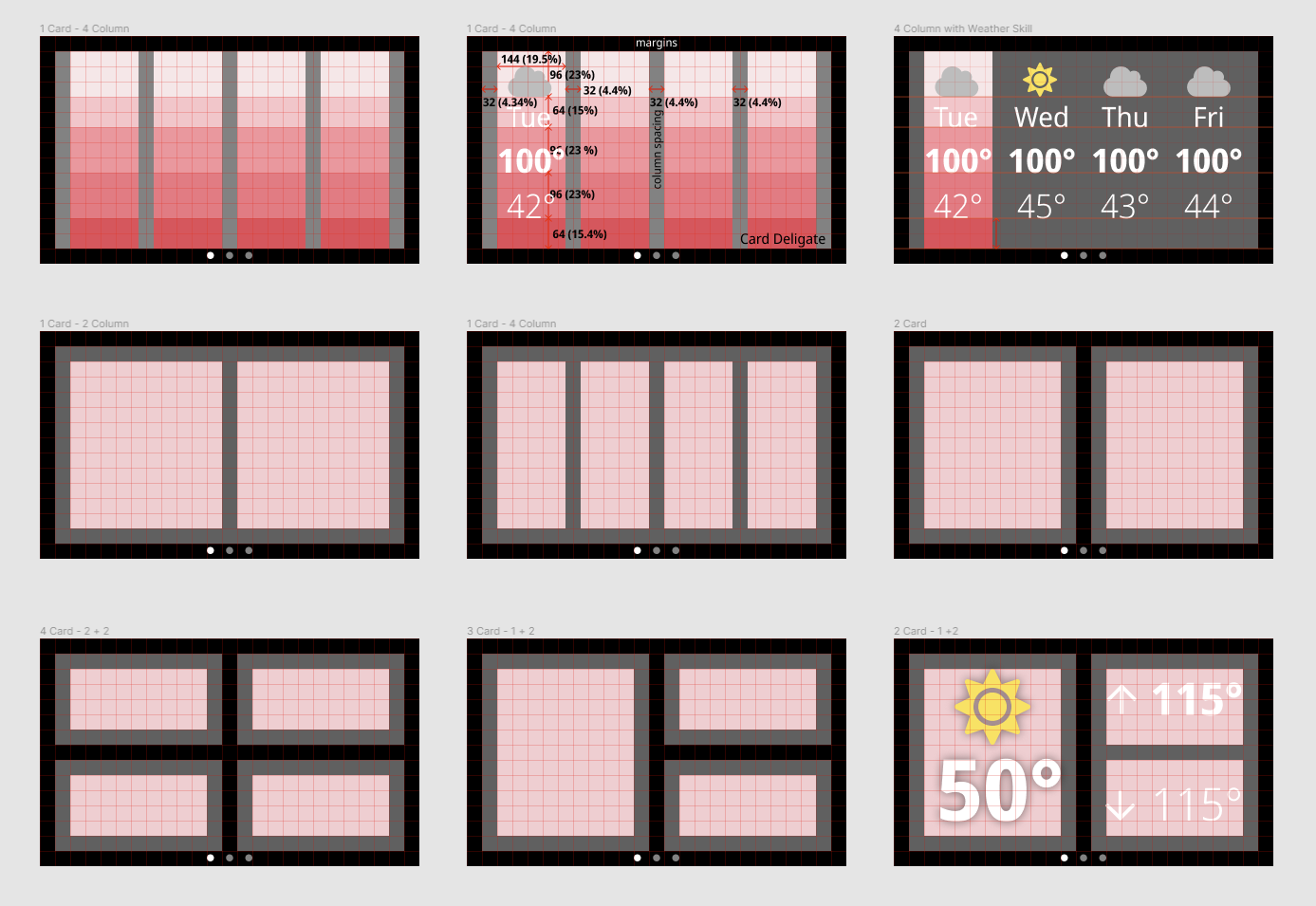
A concept was created based on layers, in which each skill (or application) would be presented on a card. Elements on the card such as text and icons visually float above the surface. The edge space between the card and the background is reserved for interaction feedback such as when Mycroft wakes up (wake word detected), when Mycroft is listening when Mycroft is thinking, and when Mycroft is speaking.
To standardize the design, a system was created based on a 16px grid, a 32px edge, and various templates.
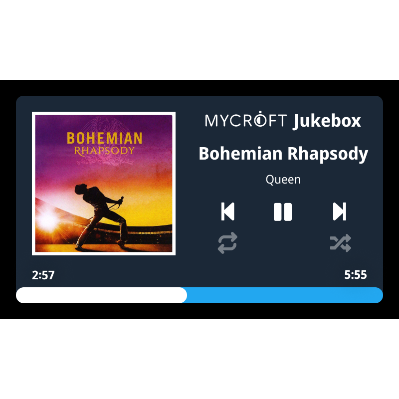
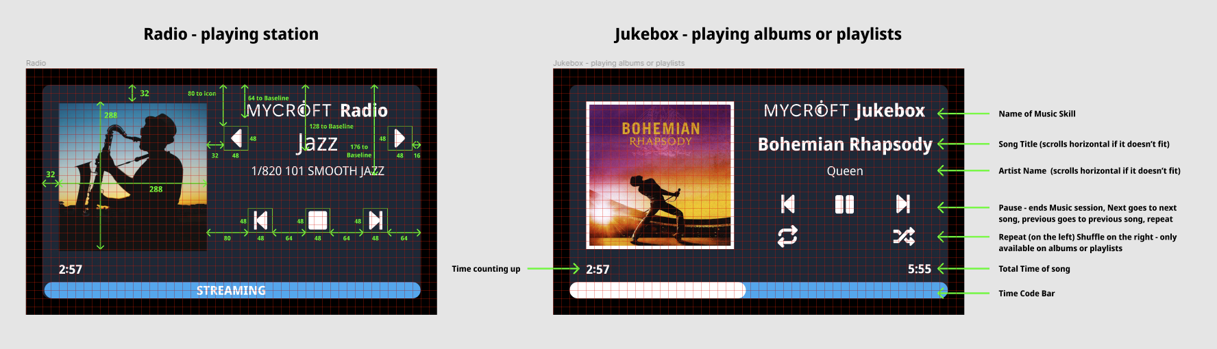
This is an example GUI mockup for the Mycroft Jukebox skill using the 16 px grid, card system, and following our basic GUI guidelines.